Designing a Modular, Scalable Careers Platform for Splunk
I was one of two UX Designers on this project, collaborating closely with the Splunk team to create a new navigation, flexible components and templates for the redesigned careers site, resulting in a scalable and intuitive user experience.
Overview
Attracting top talent in the competitive tech space requires more than just listing job openings—it demands a careers site that authentically reflects a company’s culture and values. Splunk wanted to revamp their careers site to better showcase their people-first culture, highlight company values, and make job searching more intuitive. The new site needed to feel dynamic, modern, and aligned with the broader brand voice, all while being easy to navigate for candidates across a range of technical and non-technical roles.
Building From The Ground Up
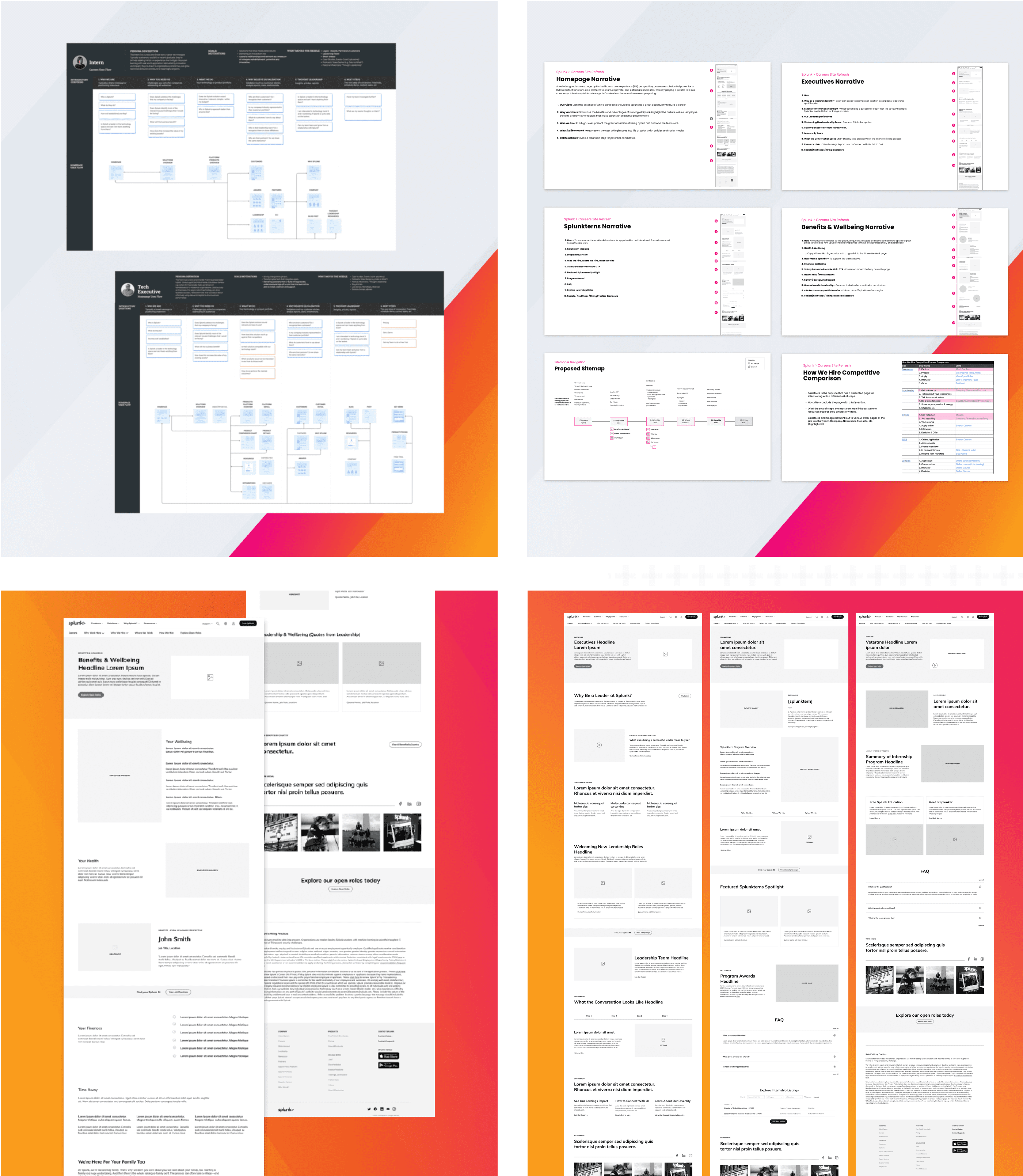
I worked alongisde one additional UX Designer on this project to conduct UX strategy and design for the Splunk careers site redesign, working closely with brand, content, and engineering teams to align on business goals and needs. We kicked off the project with collaborative workshops to define our three primary candidate personas—experienced professionals, early-career applicants, and international job seekers—and mapped user flows to understand how each would navigate the hiring experience.
From there, we developed a streamlined site architecture and proposed a simplified navigation system that prioritized clarity and simplified exploration. Through visual explorations and wireframing I ensured a user-centered approach at every stage.
Designing for Clarity, Culture, and Scale
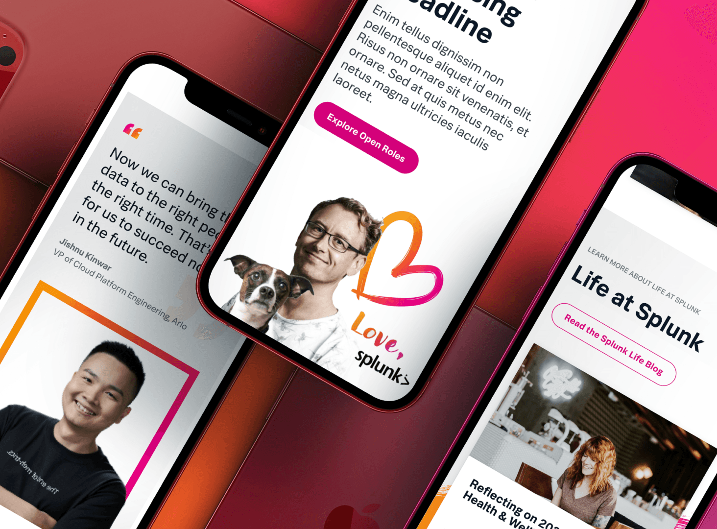
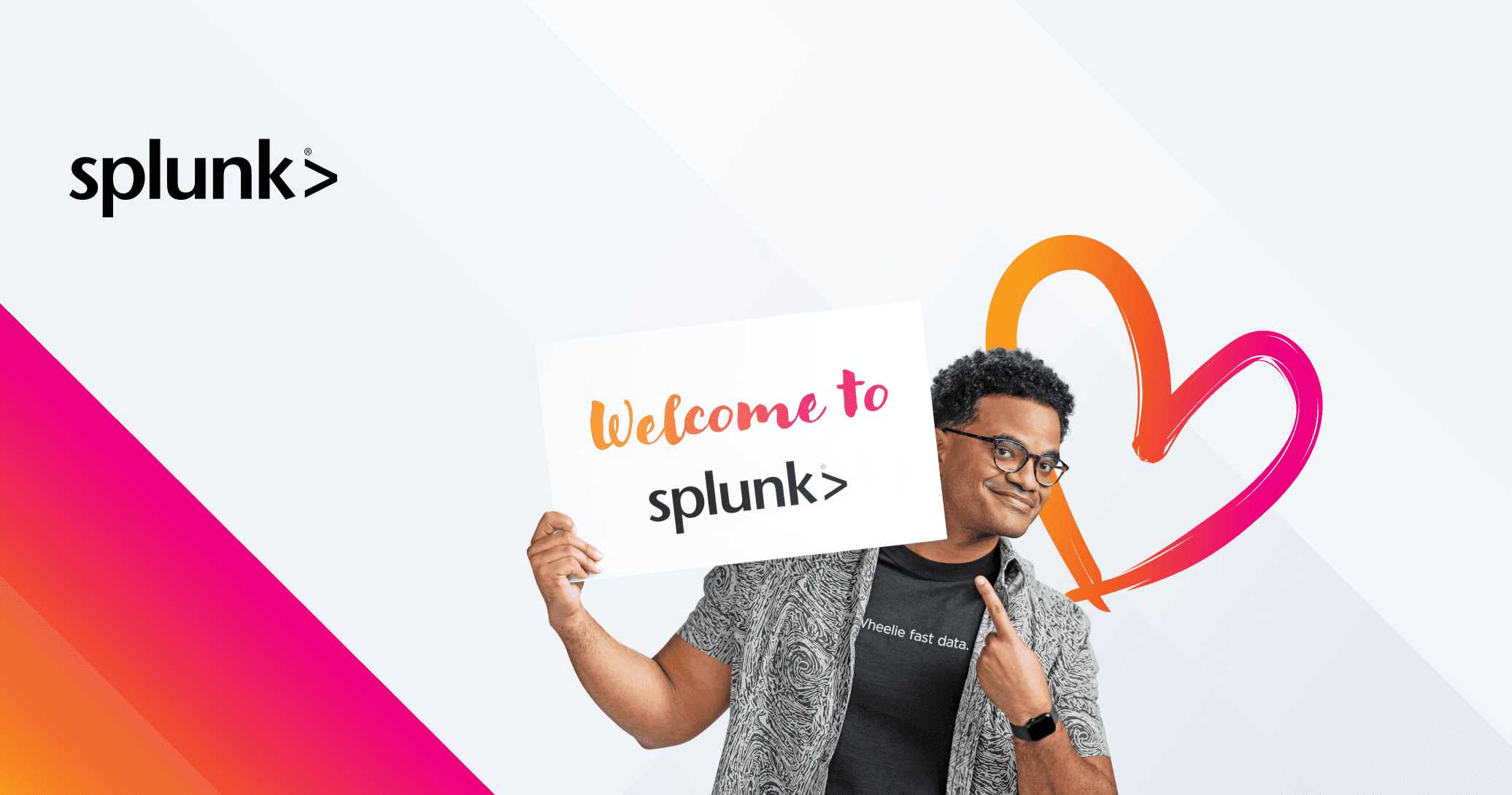
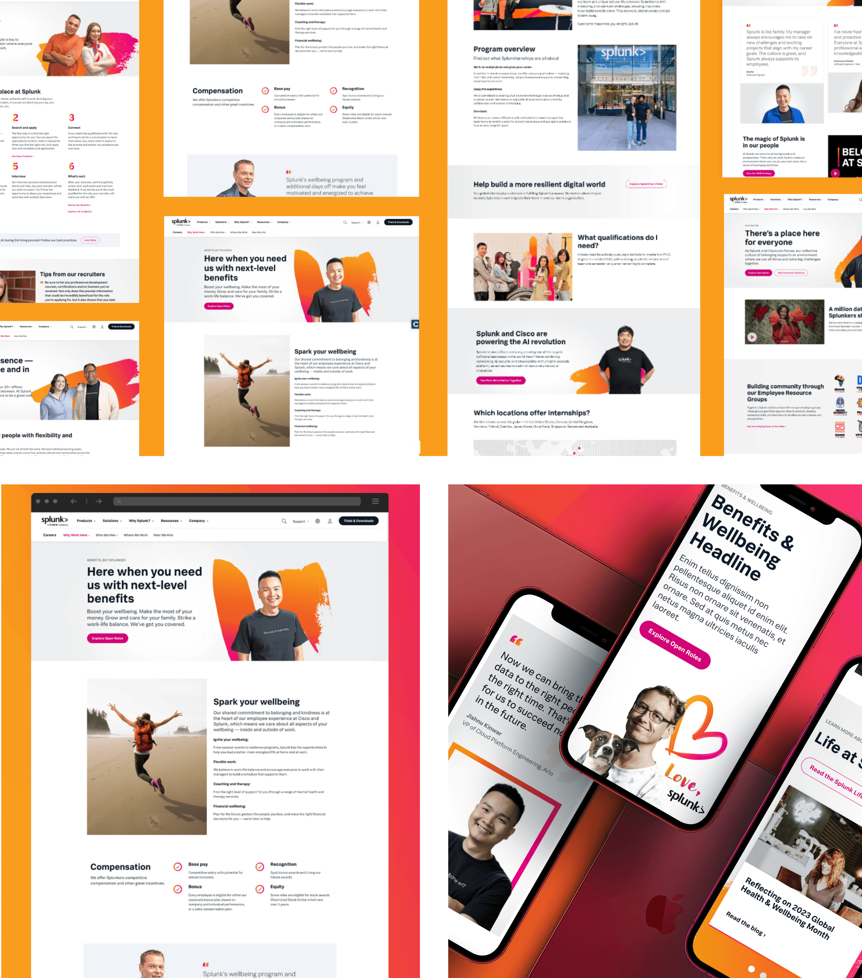
Once all research and discovery was finalized we moved into the design phase of the project. We used visual elements from Splunk’s existing brand style guide as a baseline, adapting them into a flexible component system that could scale across all careers content. Together, we designed page templates for key sections like Why Work at Splunk, Early Careers, and individual team pages—balancing storytelling with functionality. Grounded in our persona-based user flows, we created templates and individual components, refining the experience through regular feedback loops to deliver a modular, user-centered solution.
Takeaways
This project taught me the importance of balancing storytelling with functionality—especially when designing for talent recruitment. By centering real employee experiences and reducing friction in the job search process, we helped Splunk better connect with the people they want to hire.

View Next Case Study
Improving the Visual Experience For Healthcare Professionals at Surescripts.com
Designing a Modular, Scalable Careers Platform for Splunk
I was one of two UX Designers on this project, collaborating closely with the Splunk team to create a new navigation, flexible components and templates for the redesigned careers site, resulting in a scalable and intuitive user experience.
Overview
Attracting top talent in the competitive tech space requires more than just listing job openings—it demands a careers site that authentically reflects a company’s culture and values. Splunk wanted to revamp their careers site to better showcase their people-first culture, highlight company values, and make job searching more intuitive. The new site needed to feel dynamic, modern, and aligned with the broader brand voice, all while being easy to navigate for candidates across a range of technical and non-technical roles.
Building From The Ground Up
I worked alongisde one additional UX Designer on this project to conduct UX strategy and design for the Splunk careers site redesign, working closely with brand, content, and engineering teams to align on business goals and needs. We kicked off the project with collaborative workshops to define our three primary candidate personas—experienced professionals, early-career applicants, and international job seekers—and mapped user flows to understand how each would navigate the hiring experience.
From there, we developed a streamlined site architecture and proposed a simplified navigation system that prioritized clarity and simplified exploration. Through visual explorations and wireframing I ensured a user-centered approach at every stage.
Designing for Clarity, Culture, and Scale
Once all research and discovery was finalized we moved into the design phase of the project. We used visual elements from Splunk’s existing brand style guide as a baseline, adapting them into a flexible component system that could scale across all careers content. Together, we designed page templates for key sections like Why Work at Splunk, Early Careers, and individual team pages—balancing storytelling with functionality. Grounded in our persona-based user flows, we created templates and individual components, refining the experience through regular feedback loops to deliver a modular, user-centered solution.
Takeaways
This project taught me the importance of balancing storytelling with functionality—especially when designing for talent recruitment. By centering real employee experiences and reducing friction in the job search process, we helped Splunk better connect with the people they want to hire.
View Next Case Study
Improving the Visual Experience For Healthcare Professionals at Surescripts.com