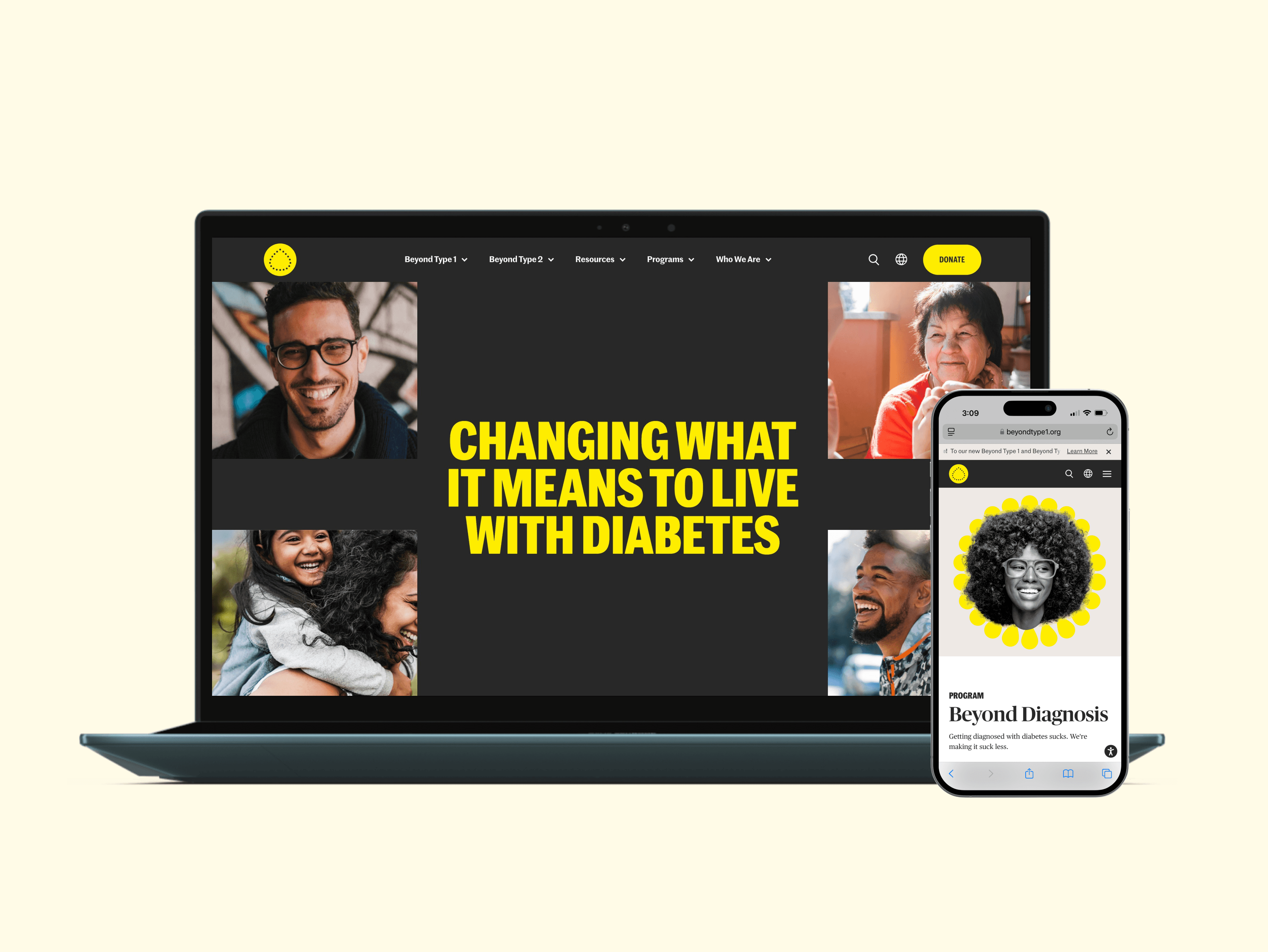
Surescripts: Building a New Scalable Design System
I was one of two Designers for this project working on creating components for the new Surescripts Design System that increased page views by 81%.

Surescripts: Building a New Scalable Design System
I was one of two Designers for this project working on creating components for the new Surescripts Design System that increased page views by 81%.
Final Outcomes
+81%
Page Views
Who Is Surescripts
As a company dedicated to making healthcare better for all, Surescripts plays an essential role in a vital market. Surescripts solutions help healthcare professionals across a wide range of organization types enhance prescribing, better inform care decisions, and advance healthcare as a whole. However, Surescripts.com did not reflect the company’s leadership position in the market or enable the type of engagement needed for optimized lead generation. My team and I collaborated with Surescripts to develop a comprehensive design system and UI kit for their digital platform. I worked closely alongside one other Designer to create components and other elements for their new Design System.

The Problem
To begin this process, I conducted a comprehensive audit of the existing UI components and design elements. This phase involved identifying inconsistencies, redundant components, and gaps in the current system to establish a clear foundation for the new design system. I cataloged all existing elements and mapped their relationships to ensure we covered every scenario in the redesign. Here are the primary observations from the audit:
Content Overload and Poor Visual Hierarchy: The previous design presented a copy-dense layout with multiple competing sections. Key messages lacked prominence, and there was limited visual distinction between primary and secondary content.
Limited Interactivity and Engagement: The site lacked dynamic elements to capture user attention. There were minimal interactive components or engaging animations, which may have hindered the ability to keep users engaged with the content.
Inconsistent Component Styling: Variations in design elements such as buttons, information cards, and text styles led to a fragmented user experience.

My Process
Creating The Design System Components
With the insights from the audit, I built a scalable design system in Figma, defining component libraries, typography, color schemes, and interaction patterns. The goal was to create a cohesive and reusable design framework that met both current and future needs. I collaborated closely with stakeholders to ensure the design decisions aligned with business objectives, balancing aesthetics and functionality.
Key considerations and implementations included:
Scalable Components: We ensured that components were versatile enough to adapt to different scenarios and screen sizes, minimizing the need for custom development.
Accessibility Standards: We adjusted and optimized color selections to ensure they adhered to WCAG AA accessibility requirements while remaining true to the brand's identity. This allowed for greater contrast and improved readability across the website without compromising brand consistency.
Consistent Interaction Patterns: Defined clear interaction states for buttons, links, and other interactive elements to create a predictable user experience.


Collaborating with Developers to Create Documentation
To ensure seamless implementation, I worked closely with the development team to create detailed documentation for the design system. This included component usage guidelines, interaction specifications, and best practices to maintain consistency across the platform.
Takeaways
The redesigned Sift.com website successfully positioned the company as a digital trust and safety leader. The new design improved user engagement, enhanced the clarity of Sift’s value propositions, and provided a scalable platform for future growth in several impactful ways:
Increased Engagement: The site now delivers a seamless experience, increasing lead conversion by 45% and improving the Homepage bounce rate by 20%.
Enhanced Visual Consistency: The unified design language improved brand perception and user experience across the site.
Increased Development Efficiency: The reusable component library significantly reduced development time and effort, enabling faster rollouts of new features.
Who Is Surescripts
As a company dedicated to making healthcare better for all, Surescripts plays an essential role in a vital market. Surescripts solutions help healthcare professionals across a wide range of organization types enhance prescribing, better inform care decisions, and advance healthcare as a whole. However, Surescripts.com did not reflect the company’s leadership position in the market or enable the type of engagement needed for optimized lead generation. My team and I collaborated with Surescripts to develop a comprehensive design system and UI kit for their digital platform. I worked closely alongside one other Designer to create components and other elements for their new Design System.
Initial Audit
To begin this process, I conducted a comprehensive audit of the existing UI components and design elements. This phase involved identifying inconsistencies, redundant components, and gaps in the current system to establish a clear foundation for the new design system. I cataloged all existing elements and mapped their relationships to ensure we covered every scenario in the redesign. Here are the primary observations from the audit:
Content Overload and Poor Visual Hierarchy: The previous design presented a copy-dense layout with multiple competing sections. Key messages lacked prominence, and there was limited visual distinction between primary and secondary content.
Limited Interactivity and Engagement: The site lacked dynamic elements to capture user attention. There were minimal interactive components or engaging animations, which may have hindered the ability to keep users engaged with the content.
Inconsistent Component Styling: Variations in design elements such as buttons, information cards, and text styles led to a fragmented user experience.
My Process
Creating The Design System Components
With the insights from the audit, I built a scalable design system in Figma, defining component libraries, typography, color schemes, and interaction patterns. The goal was to create a cohesive and reusable design framework that met both current and future needs. I collaborated closely with stakeholders to ensure the design decisions aligned with business objectives, balancing aesthetics and functionality.
Key considerations and implementations included:
Scalable Components: We ensured that components were versatile enough to adapt to different scenarios and screen sizes, minimizing the need for custom development.
Accessibility Standards: We adjusted and optimized color selections to ensure they adhered to WCAG AA accessibility requirements while remaining true to the brand's identity. This allowed for greater contrast and improved readability across the website without compromising brand consistency.
Consistent Interaction Patterns: Defined clear interaction states for buttons, links, and other interactive elements to create a predictable user experience.
Collaborating with Developers to Create Documentation
To ensure seamless implementation, I worked closely with the development team to create detailed documentation for the design system. This included component usage guidelines, interaction specifications, and best practices to maintain consistency across the platform.
Takeaways
The design system delivered significant improvements for Surescripts, including an impressive 81% increase in page views:
Improved Visual Consistency: A unified design language enhanced brand perception and user experience.
Development Efficiency: Reusable components reduced development time and facilitated faster feature rollouts.
Enhanced Accessibility and Responsiveness: The site became more inclusive and optimized for all devices.
As a UX/UI designer, I found this project to be a fantastic opportunity to build on my visual design experience. It highlighted the importance of design systems in scaling digital experiences and improving user satisfaction. I gained a deeper understanding of collaborating with cross-functional teams, maintaining a user-focused approach, and documenting design work for long-term impact.
Surescripts: Building a New Scalable Design System
I was one of two Designers for this project working on creating components for the new Surescripts Design System that increased page views by 81%.
Surescripts: Building a New Scalable Design System
I was one of two Designers for this project working on creating components for the new Surescripts Design System that increased page views by 81%.
Final Outcomes
+81%
Page Views
Who Is Surescripts
As a company dedicated to making healthcare better for all, Surescripts plays an essential role in a vital market. Surescripts solutions help healthcare professionals across a wide range of organization types enhance prescribing, better inform care decisions, and advance healthcare as a whole. However, Surescripts.com did not reflect the company’s leadership position in the market or enable the type of engagement needed for optimized lead generation. My team and I collaborated with Surescripts to develop a comprehensive design system and UI kit for their digital platform. I worked closely alongside one other Designer to create components and other elements for their new Design System.
The Problem
To begin this process, I conducted a comprehensive audit of the existing UI components and design elements. This phase involved identifying inconsistencies, redundant components, and gaps in the current system to establish a clear foundation for the new design system. I cataloged all existing elements and mapped their relationships to ensure we covered every scenario in the redesign. Here are the primary observations from the audit:
Content Overload and Poor Visual Hierarchy: The previous design presented a copy-dense layout with multiple competing sections. Key messages lacked prominence, and there was limited visual distinction between primary and secondary content.
Limited Interactivity and Engagement: The site lacked dynamic elements to capture user attention. There were minimal interactive components or engaging animations, which may have hindered the ability to keep users engaged with the content.
Inconsistent Component Styling: Variations in design elements such as buttons, information cards, and text styles led to a fragmented user experience.
My Process
Creating The Design System Components
With the insights from the audit, I built a scalable design system in Figma, defining component libraries, typography, color schemes, and interaction patterns. The goal was to create a cohesive and reusable design framework that met both current and future needs. I collaborated closely with stakeholders to ensure the design decisions aligned with business objectives, balancing aesthetics and functionality.
Key considerations and implementations included:
Scalable Components: We ensured that components were versatile enough to adapt to different scenarios and screen sizes, minimizing the need for custom development.
Accessibility Standards: We adjusted and optimized color selections to ensure they adhered to WCAG AA accessibility requirements while remaining true to the brand's identity. This allowed for greater contrast and improved readability across the website without compromising brand consistency.
Consistent Interaction Patterns: Defined clear interaction states for buttons, links, and other interactive elements to create a predictable user experience.
Collaborating with Developers to Create Documentation
To ensure seamless implementation, I worked closely with the development team to create detailed documentation for the design system. This included component usage guidelines, interaction specifications, and best practices to maintain consistency across the platform.
Takeaways
The redesigned Sift.com website successfully positioned the company as a digital trust and safety leader. The new design improved user engagement, enhanced the clarity of Sift’s value propositions, and provided a scalable platform for future growth in several impactful ways:
Increased Engagement: The site now delivers a seamless experience, increasing lead conversion by 45% and improving the Homepage bounce rate by 20%.
Enhanced Visual Consistency: The unified design language improved brand perception and user experience across the site.
Increased Development Efficiency: The reusable component library significantly reduced development time and effort, enabling faster rollouts of new features.
Who Is Surescripts
As a company dedicated to making healthcare better for all, Surescripts plays an essential role in a vital market. Surescripts solutions help healthcare professionals across a wide range of organization types enhance prescribing, better inform care decisions, and advance healthcare as a whole. However, Surescripts.com did not reflect the company’s leadership position in the market or enable the type of engagement needed for optimized lead generation. My team and I collaborated with Surescripts to develop a comprehensive design system and UI kit for their digital platform. I worked closely alongside one other Designer to create components and other elements for their new Design System.
Initial Audit
To begin this process, I conducted a comprehensive audit of the existing UI components and design elements. This phase involved identifying inconsistencies, redundant components, and gaps in the current system to establish a clear foundation for the new design system. I cataloged all existing elements and mapped their relationships to ensure we covered every scenario in the redesign. Here are the primary observations from the audit:
Content Overload and Poor Visual Hierarchy: The previous design presented a copy-dense layout with multiple competing sections. Key messages lacked prominence, and there was limited visual distinction between primary and secondary content.
Limited Interactivity and Engagement: The site lacked dynamic elements to capture user attention. There were minimal interactive components or engaging animations, which may have hindered the ability to keep users engaged with the content.
Inconsistent Component Styling: Variations in design elements such as buttons, information cards, and text styles led to a fragmented user experience.
My Process
Creating The Design System Components
With the insights from the audit, I built a scalable design system in Figma, defining component libraries, typography, color schemes, and interaction patterns. The goal was to create a cohesive and reusable design framework that met both current and future needs. I collaborated closely with stakeholders to ensure the design decisions aligned with business objectives, balancing aesthetics and functionality.
Key considerations and implementations included:
Scalable Components: We ensured that components were versatile enough to adapt to different scenarios and screen sizes, minimizing the need for custom development.
Accessibility Standards: We adjusted and optimized color selections to ensure they adhered to WCAG AA accessibility requirements while remaining true to the brand's identity. This allowed for greater contrast and improved readability across the website without compromising brand consistency.
Consistent Interaction Patterns: Defined clear interaction states for buttons, links, and other interactive elements to create a predictable user experience.
Collaborating with Developers to Create Documentation
To ensure seamless implementation, I worked closely with the development team to create detailed documentation for the design system. This included component usage guidelines, interaction specifications, and best practices to maintain consistency across the platform.
Takeaways
The design system delivered significant improvements for Surescripts, including an impressive 81% increase in page views:
Improved Visual Consistency: A unified design language enhanced brand perception and user experience.
Development Efficiency: Reusable components reduced development time and facilitated faster feature rollouts.
Enhanced Accessibility and Responsiveness: The site became more inclusive and optimized for all devices.