Sift: Boosting Lead Conversions
I was the lead UX Designer and researcher for this project, conducting research such as A/B testing and creating wireframes for the new Sift site, which helped increase conversions by 45%.

Final Outcomes
+45%
Lead Conversion
+25%
Page Views
+2min
Visit Duration
Petal & Bloom
Petal & Bloom is a boutique online floral shop known for its unique, hand-crafted floral arrangements. They approached us to elevate their digital presence with a captivating visual identity for social media, aiming to increase brand recognition and engagement while highlighting their distinct, artisanal approach to floristry.
Final Outcomes
+45%
Lead Conversion
+25%
Page Views
+2min
Visit Duration
Who Is Sift
As a pioneer in AI-powered digital risk assessment, Sift helps digital businesses grow with confidence. While their brand set the standard that many others aspired to, it wasn’t setting them apart in a crowded market. To differentiate their platform in a sea of sameness, Sift needed a bold new look and feel. My team and I collaborated with Sift.com to redesign their website, aligning it with their evolving brand identity and enhancing user engagement. I was the UX Lead for the project, working closely with the Sift team and two other designers and developers to assist in the design and development process.

The Problem
Sift's existing website faced several challenges, including a fragmented user experience, outdated design elements, and an inability to communicate the company’s value propositions effectively. During our initial kickoff meeting with the team, we found out that, at the time..
Sift had a 75% bounce rate which was significantly higher compared to most Fortune 500 B2B companies
As Sift continued to expand its market presence, presenting a more cohesive and engaging digital experience that resonated with its target audience became essential.
Research & Explorations
As the lead UX Designer on the team, I conducted a competitive analysis as well as user interviews to better understand the competitive landscape and B2B best practices.
From the interviews with customers - we extracted some interesting insights about the messaging and content of Sift.com. The most frequently met frustrations was that “They need to talk more about the different use cases, and what they can do for the customer. They need to answer: “What’s in it for me?”.
From the Competitive Analysis - The major pain-points were Sift was falling short in traffic & engagement, there was outdated lead capture methods and lots of visual design inconsistencies.

Improving The User Journey
Before wireframing and designing the site pages, I prioritized the most critical aspects: the navigation and site architecture. This would ensure an intuitive experience that was easy to navigate. To achieve this, I employed a two-pronged approach:
1. I first conducted a sitemap of the entire website to visualize the information architecture of the site and to get an idea of the amount of content and how the content is grouped.
2. I conducted an in-depth analysis of the site's top 100 pages within Google Analytics to identify which pages users were engaging within the navigation.

Solution One: Improving Homepage Retention
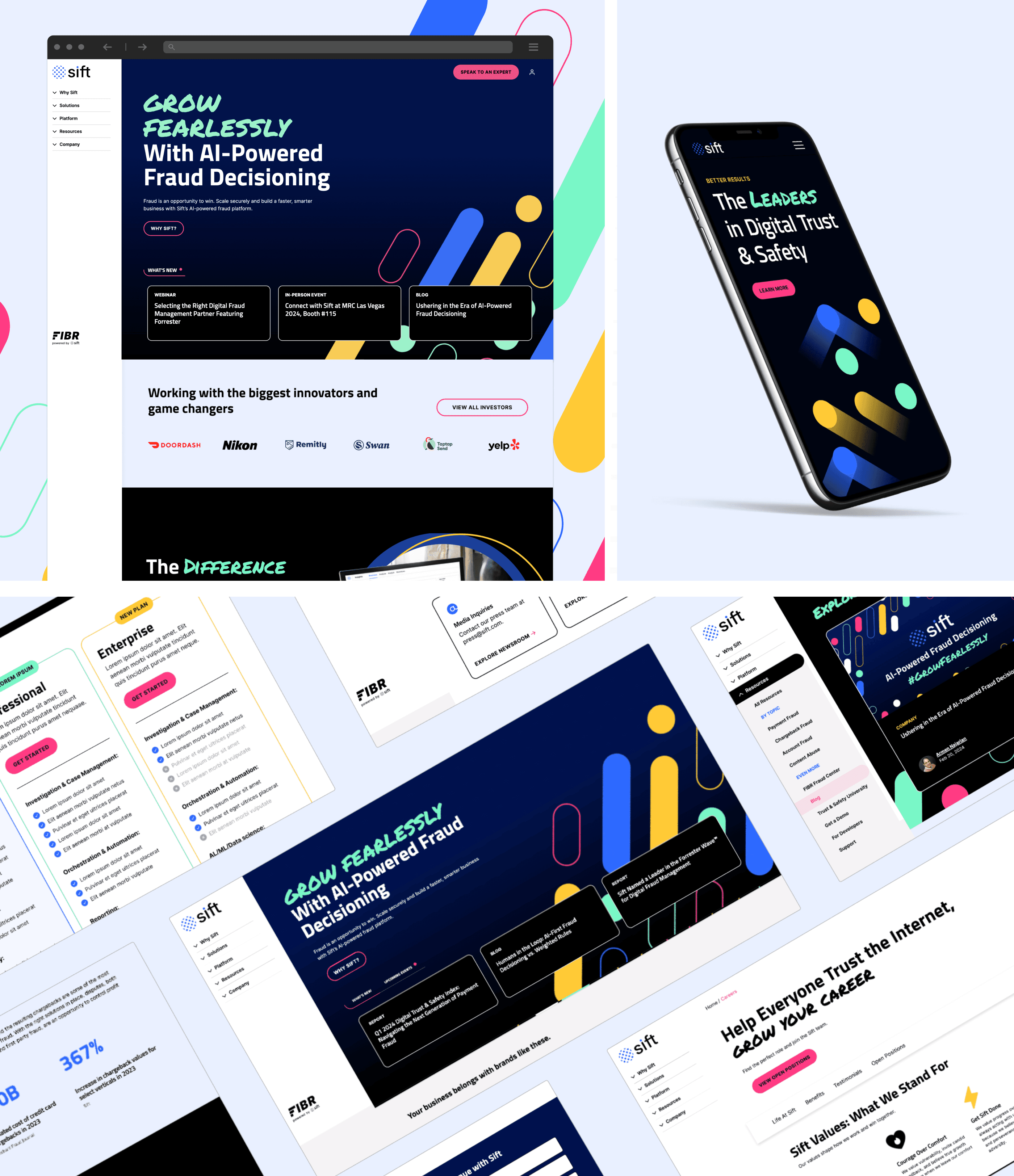
Once the navigation had been approved, I began working alongside the Sift team to wireframe, design and define page narrative strategy for 15+ templates for the new Sift Site. I focused on desktop first since roughly 80% of users that access Sift.com are doing so on a desktop device. However, I considered mobile features when proposing certain components and specific page features.
For the Homepage I recommended implementing a new content strategy that communicates who we are, what we do, why you need us, and the next steps—building trust, showcasing value, and guiding users toward action.
This helped decrease the bounce rate of the page from 75% to 55%

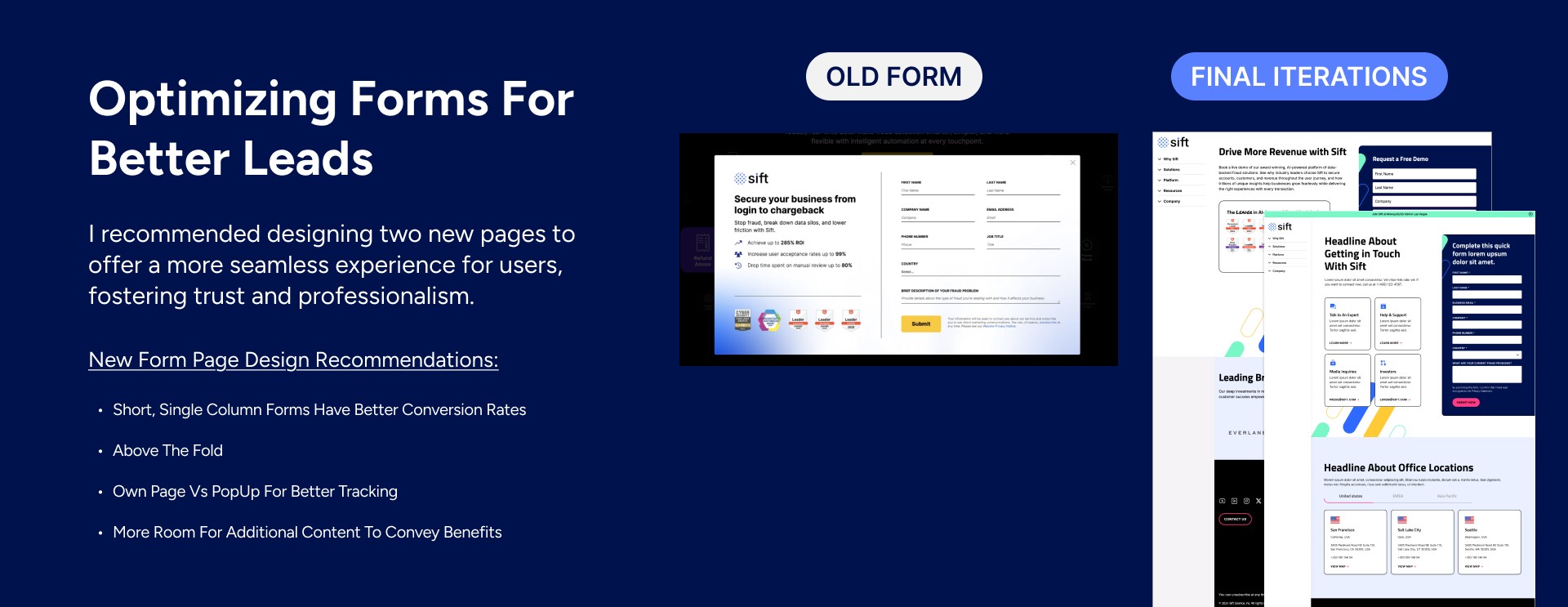
Solution Two: Better Forms = Better Leads
With Sift's primary goal of the project being improving lead generation metrics I noticed during my initial audit of the old Sift.com site that there were a lot of areas of opportunity.
I recommended designing two new pages to offer a more seamless experience for users, fostering trust and professionalism.
This allowed for optimized form design and improved completion rates by up to 37%, providing sales teams with better-quality leads for follow-up.
Solution Three: A Scalable, Reusable Component Kit
Another one of Sift's issue was the lack of consistency when it came to the visual experience. We aimed to create a more consistent and polished visual experience by implementing a scalable UI kit to establish design consistency across pages.
I worked alongside two other visual designers to create the UI Kit. My role focused on creating reusable components such as buttons, forms, and content sections while the other designers focused on typography and color.
This allowed for a more consistent visual experience as well as improved efficiency and scalability for the client when it came to making future content adjustments.

Takeaways
The redesigned Sift.com website successfully positioned the company as a digital trust and safety leader. The new design improved user engagement, enhanced the clarity of Sift’s value propositions, and provided a scalable platform for future growth in several impactful ways:
Increased Engagement: The site now delivers a seamless experience, increasing lead conversion by 45% and improving the Homepage bounce rate by 20%.
Enhanced Visual Consistency: The unified design language improved brand perception and user experience across the site.
Increased Development Efficiency: The reusable component library significantly reduced development time and effort, enabling faster rollouts of new features.
Who Is Sift
As a pioneer in AI-powered digital risk assessment, Sift helps digital businesses grow with confidence. While their brand set the standard that many others aspired to, it wasn’t setting them apart in a crowded market. To differentiate their platform in a sea of sameness, Sift needed a bold new look and feel. My team and I collaborated with Sift.com to redesign their website, aligning it with their evolving brand identity and enhancing user engagement. I was the UX Lead for the project, working closely with the Sift team and two other designers and developers to assist in the design and development process.
The Problem
Sift's existing website faced several challenges, including a fragmented user experience, outdated design elements, and an inability to communicate the company’s value propositions effectively. During our initial kickoff meeting with the team, we found out that, at the time..
Sift had a 75% bounce rate which was significantly higher compared to most Fortune 500 B2B companies
As Sift continued to expand its market presence, presenting a more cohesive and engaging digital experience that resonated with its target audience became essential.
Research & Explorations
As the lead UX Designer on the team, I conducted a competitive analysis as well as user interviews to better understand the competitive landscape and B2B best practices.
From the interviews with customers - we extracted some interesting insights about the messaging and content of Sift.com. The most frequently met frustrations was that “They need to talk more about the different use cases, and what they can do for the customer. They need to answer: “What’s in it for me?”.
From the Competitive Analysis - The major pain-points were Sift was falling short in traffic & engagement, there was outdated lead capture methods and lots of visual design inconsistencies.
Improving The User Journey
Before wireframing and designing the site pages, I prioritized the most critical aspects: the navigation and site architecture. This would ensure an intuitive experience that was easy to navigate. To achieve this, I employed a two-pronged approach:
1. I first conducted a sitemap of the entire website to visualize the information architecture of the site and to get an idea of the amount of content and how the content is grouped.
2. I conducted an in-depth analysis of the site's top 100 pages within Google Analytics to identify which pages users were engaging within the navigation.
Solution One: Improving Homepage Retention
Once the navigation had been approved, I began working alongside the Sift team to wireframe, design and define page narrative strategy for 15+ templates for the new Sift Site. I focused on desktop first since roughly 80% of users that access Sift.com are doing so on a desktop device. However, I considered mobile features when proposing certain components and specific page features.
For the Homepage I recommended implementing a new content strategy that communicates who we are, what we do, why you need us, and the next steps—building trust, showcasing value, and guiding users toward action.
This helped decrease the bounce rate of the page from 75% to 55%
Solution Two: Better Forms = Better Leads
With Sift's primary goal of the project being improving lead generation metrics I noticed during my initial audit of the old Sift.com site that there were a lot of areas of opportunity.
I recommended designing two new pages to offer a more seamless experience for users, fostering trust and professionalism.
This allowed for optimized form design and improved completion rates by up to 37%, providing sales teams with better-quality leads for follow-up.
Solution Three: A Scalable, Reusable Component Kit
Another one of Sift's issue was the lack of consistency when it came to the visual experience. We aimed to create a more consistent and polished visual experience by implementing a scalable UI kit to establish design consistency across pages.
I worked alongside two other visual designers to create the UI Kit. My role focused on creating reusable components such as buttons, forms, and content sections while the other designers focused on typography and color.
This allowed for a more consistent visual experience as well as improved efficiency and scalability for the client when it came to making future content adjustments.
Takeaways
The redesigned Sift.com website successfully positioned the company as a digital trust and safety leader. The new design improved user engagement, enhanced the clarity of Sift’s value propositions, and provided a scalable platform for future growth in several impactful ways:
Increased Engagement: The site now delivers a seamless experience, increasing lead conversion by 45% and improving the Homepage bounce rate by 20%.
Enhanced Visual Consistency: The unified design language improved brand perception and user experience across the site.
Increased Development Efficiency: The reusable component library significantly reduced development time and effort, enabling faster rollouts of new features.
View Next Case Study
Enhancing the Knife Buying Experience for Colombia River Knife and Tools
Sift: Boosting Lead Conversions
I was the lead UX Designer and researcher for this project, conducting research such as A/B testing and creating wireframes for the new Sift site, which helped increase conversions by 45%.
Final Outcomes
+45%
Lead Conversion
+25%
Page Views
+2min
Visit Duration
Petal & Bloom
Petal & Bloom is a boutique online floral shop known for its unique, hand-crafted floral arrangements. They approached us to elevate their digital presence with a captivating visual identity for social media, aiming to increase brand recognition and engagement while highlighting their distinct, artisanal approach to floristry.
Final Outcomes
+45%
Lead Conversion
+25%
Page Views
+2min
Visit Duration
Who Is Sift
As a pioneer in AI-powered digital risk assessment, Sift helps digital businesses grow with confidence. While their brand set the standard that many others aspired to, it wasn’t setting them apart in a crowded market. To differentiate their platform in a sea of sameness, Sift needed a bold new look and feel. My team and I collaborated with Sift.com to redesign their website, aligning it with their evolving brand identity and enhancing user engagement. I was the UX Lead for the project, working closely with the Sift team and two other designers and developers to assist in the design and development process.
The Problem
Sift's existing website faced several challenges, including a fragmented user experience, outdated design elements, and an inability to communicate the company’s value propositions effectively. During our initial kickoff meeting with the team, we found out that, at the time..
Sift had a 75% bounce rate which was significantly higher compared to most Fortune 500 B2B companies
As Sift continued to expand its market presence, presenting a more cohesive and engaging digital experience that resonated with its target audience became essential.
Research & Explorations
As the lead UX Designer on the team, I conducted a competitive analysis as well as user interviews to better understand the competitive landscape and B2B best practices.
From the interviews with customers - we extracted some interesting insights about the messaging and content of Sift.com. The most frequently met frustrations was that “They need to talk more about the different use cases, and what they can do for the customer. They need to answer: “What’s in it for me?”.
From the Competitive Analysis - The major pain-points were Sift was falling short in traffic & engagement, there was outdated lead capture methods and lots of visual design inconsistencies.
Improving The User Journey
Before wireframing and designing the site pages, I prioritized the most critical aspects: the navigation and site architecture. This would ensure an intuitive experience that was easy to navigate. To achieve this, I employed a two-pronged approach:
1. I first conducted a sitemap of the entire website to visualize the information architecture of the site and to get an idea of the amount of content and how the content is grouped.
2. I conducted an in-depth analysis of the site's top 100 pages within Google Analytics to identify which pages users were engaging within the navigation.
Solution One: Improving Homepage Retention
Once the navigation had been approved, I began working alongside the Sift team to wireframe, design and define page narrative strategy for 15+ templates for the new Sift Site. I focused on desktop first since roughly 80% of users that access Sift.com are doing so on a desktop device. However, I considered mobile features when proposing certain components and specific page features.
For the Homepage I recommended implementing a new content strategy that communicates who we are, what we do, why you need us, and the next steps—building trust, showcasing value, and guiding users toward action.
This helped decrease the bounce rate of the page from 75% to 55%
Solution Two: Better Forms = Better Leads
With Sift's primary goal of the project being improving lead generation metrics I noticed during my initial audit of the old Sift.com site that there were a lot of areas of opportunity.
I recommended designing two new pages to offer a more seamless experience for users, fostering trust and professionalism.
This allowed for optimized form design and improved completion rates by up to 37%, providing sales teams with better-quality leads for follow-up.
Solution Three: A Scalable, Reusable Component Kit
Another one of Sift's issue was the lack of consistency when it came to the visual experience. We aimed to create a more consistent and polished visual experience by implementing a scalable UI kit to establish design consistency across pages.
I worked alongside two other visual designers to create the UI Kit. My role focused on creating reusable components such as buttons, forms, and content sections while the other designers focused on typography and color.
This allowed for a more consistent visual experience as well as improved efficiency and scalability for the client when it came to making future content adjustments.
Takeaways
The redesigned Sift.com website successfully positioned the company as a digital trust and safety leader. The new design improved user engagement, enhanced the clarity of Sift’s value propositions, and provided a scalable platform for future growth in several impactful ways:
Increased Engagement: The site now delivers a seamless experience, increasing lead conversion by 45% and improving the Homepage bounce rate by 20%.
Enhanced Visual Consistency: The unified design language improved brand perception and user experience across the site.
Increased Development Efficiency: The reusable component library significantly reduced development time and effort, enabling faster rollouts of new features.
View Next Case Study
Enhancing the Knife Buying Experience for Colombia River Knife and Tools
Sift: Boosting Lead Conversions
I was the lead UX Designer and researcher for this project, conducting research such as A/B testing and creating wireframes for the new Sift site, which helped increase conversions by 45%.
Final Outcomes
+45%
Lead Conversion
+25%
Page Views
+2min
Visit Duration
Sift: Boosting Lead Conversions
I was the lead UX Designer and researcher for this project, conducting research such as A/B testing and creating wireframes for the new Sift site, which helped increase conversions by 45%.
Final Outcomes
+45%
Lead Conversion
+25%
Page Views
+2min
Visit Duration
Who Is Sift
As a pioneer in AI-powered digital risk assessment, Sift helps digital businesses grow with confidence. While their brand set the standard that many others aspired to, it wasn’t setting them apart in a crowded market. To differentiate their platform in a sea of sameness, Sift needed a bold new look and feel. My team and I collaborated with Sift.com to redesign their website, aligning it with their evolving brand identity and enhancing user engagement. I was the UX Lead for the project, working closely with the Sift team and two other designers and developers to assist in the design and development process.
The Problem
Sift's existing website faced several challenges, including a fragmented user experience, outdated design elements, and an inability to communicate the company’s value propositions effectively. During our initial kickoff meeting with the team, we found out that, at the time..
Sift had a 75% bounce rate which was significantly higher compared to most Fortune 500 B2B companies
As Sift continued to expand its market presence, presenting a more cohesive and engaging digital experience that resonated with its target audience became essential.
Research & Explorations
As the lead UX Designer on the team, I conducted a competitive analysis as well as user interviews to better understand the competitive landscape and B2B best practices.
From the interviews with customers - we extracted some interesting insights about the messaging and content of Sift.com. The most frequently met frustrations was that “They need to talk more about the different use cases, and what they can do for the customer. They need to answer: “What’s in it for me?”.
From the Competitive Analysis - The major pain-points were Sift was falling short in traffic & engagement, there was outdated lead capture methods and lots of visual design inconsistencies.
Improving The User Journey
Before wireframing and designing the site pages, I prioritized the most critical aspects: the navigation and site architecture. This would ensure an intuitive experience that was easy to navigate. To achieve this, I employed a two-pronged approach:
1. I first conducted a sitemap of the entire website to visualize the information architecture of the site and to get an idea of the amount of content and how the content is grouped.
2. I conducted an in-depth analysis of the site's top 100 pages within Google Analytics to identify which pages users were engaging within the navigation.
Solution One: Improving Homepage Retention
Once the navigation had been approved, I began working alongside the Sift team to wireframe, design and define page narrative strategy for 15+ templates for the new Sift Site. I focused on desktop first since roughly 80% of users that access Sift.com are doing so on a desktop device. However, I considered mobile features when proposing certain components and specific page features.
For the Homepage I recommended implementing a new content strategy that communicates who we are, what we do, why you need us, and the next steps—building trust, showcasing value, and guiding users toward action.
This helped decrease the bounce rate of the page from 75% to 55%
Solution Two: Better Forms = Better Leads
With Sift's primary goal of the project being improving lead generation metrics I noticed during my initial audit of the old Sift.com site that there were a lot of areas of opportunity.
I recommended designing two new pages to offer a more seamless experience for users, fostering trust and professionalism.
This allowed for optimized form design and improved completion rates by up to 37%, providing sales teams with better-quality leads for follow-up.
Solution Three: A Scalable, Reusable Component Kit
Another one of Sift's issue was the lack of consistency when it came to the visual experience. We aimed to create a more consistent and polished visual experience by implementing a scalable UI kit to establish design consistency across pages.
I worked alongside two other visual designers to create the UI Kit. My role focused on creating reusable components such as buttons, forms, and content sections while the other designers focused on typography and color.
This allowed for a more consistent visual experience as well as improved efficiency and scalability for the client when it came to making future content adjustments.
Takeaways
The redesigned Sift.com website successfully positioned the company as a digital trust and safety leader. The new design improved user engagement, enhanced the clarity of Sift’s value propositions, and provided a scalable platform for future growth in several impactful ways:
Increased Engagement: The site now delivers a seamless experience, increasing lead conversion by 45% and improving the Homepage bounce rate by 20%.
Enhanced Visual Consistency: The unified design language improved brand perception and user experience across the site.
Increased Development Efficiency: The reusable component library significantly reduced development time and effort, enabling faster rollouts of new features.
View Next Case Study
Enhancing the Knife Buying Experience for Colombia River Knife and Tools